In my experience, User Experience (commonly shortened to UX) might be the most critically overlooked aspect of website design and development today. When done correctly, it can bring huge benefits to any web project yet it remains fiercely under-utilized.
So what is it? Boiled down for simplicity, user experience is the act of studying how people use a thing, so that we can address issues and make the thing easier to use. It’s a multi-faceted term so that’s perhaps an unfair over-simplification, but we’re here to get our feet wet, not set a depth record.
Think of UX like the psychology side to design. It is used to help us understand the various quirks and complexities of human users. By recognizing and understanding them, we can build things that serve them best. We may build or design something that works great for us, but perhaps we’ve lost focus that some people will be using our product under stress, or with a disability, or a lack of critical knowledge. All these things that we take for granted can be illuminated through user experience exercises.
We never get it right the first time
Humans are complicated, and many of us are guilty of overlooking that fact. When we set out to build a product (like a website), there are design basics and common rules to follow. The task doesn’t end there however, because when it comes to human behaviour, there will be unexpected hitches abound.

As the people who are involved with the building of the website, we often see a website through various lenses that cloud our judgement. We’ve been with the site since the beginning (either as a business owner, employee, designer, or developer) so we have a level of comfort with it that the end users never will. Simply by working in the business, your level of understanding is in a different atmosphere than somebody who realized you existed 30 seconds prior. As a result, a rift can exist between how we feel people will behave and how they end up behaving. This rift creates blind spots, and UX is the tool we use to identify them.
I’ve been building websites for over a decade now, and I can say with confidence the number of times a project hits it out of the park on launch without any adjustment after the fact is zero. I’ve been a part of many wonderful projects, but the only ones that truly hit the mark are the ones that pay attention and iterate at all stages (including post-launch). That’s not due to a lack of skill or experience, but rather a fact that problems rarely have only one side. We have to pick things up and look at them from different angles to get it right, and often it’s the users that show us the way here. They provide us the road map.
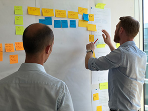
Examples of what a user experience exercise might look like on a website
One reason a “what is UX” post can be tricky to write, is that UX is actually a huge discipline. There are people who have built entire careers around a single slice of the UX process. There’s people who only plan, only draw layouts or schematics, only design buttons, or only watch people use products and gather complaints.
Let’s breakdown what building a website with UX in mind might entail, and maybe you can see a step or two that can be integrated into your own process.
Taking feedback from target customers
Getting to know your customers/users is overlooked far more often than you might expect. The simple act of getting in front of them and asking them some questions can go a long way to helping you plan a website. Already have a site but still want to try? Ask around within the company to see if anybody can point to feedback they’ve received on more than one occasion. If you have a person who primarily deals with complaints, they can be a goldmine of information.
Content organization
It doesn’t matter how big your site is, it can get overwhelming when you’re dealing with content. A common strategy is to use sticky notes and a wall to give yourself a simplified view of everything. Sometimes a slight perspective shift can go a long way to detecting where content should be moved around or adjusted.
Prototypes

If you’re still early in the planning stages, prototypes are one of the most impactful things to build because they can be extremely flexible and let you iterate on the fly. They can be as simple as a website layout comprised of paper pieces. Say you bring in 10 people and you notice that none of the seem able to find the products? Physically grab the “About Us” button you’ve got on the banner and replace it with a “See Our Products” button. Then bring in 10 more and see if the issue persists.
You can use prototypes through the entirety of a project. Sometimes instead of building out a whole new layout for a client, I’ll create something quick and flashy in a design application first so they can play around with it. It isn’t a site, but it looks like one, and they can click on it and see where things go. It can be whipped up on my end in moments and it saves a lot of time for everyone by allowing us to target unforeseen pitfalls or challenges.
Watching users use the site or product and identifying pain points
This is one of the more eye-opening exercises for everyone from web developers to business owners. To watch a person click around your website and stumble in ways you’ve never dreamed of is both humbling and incredibly valuable. This is where you find out that the callout you developed isn’t all that noticeable, or the contact form you’ve got on your homepage leaves people with a concerning feeling that nothing went through. Watching users is an incredibly low cost activity compared to the value it can produce for you in the end.
The process can be as simple as this: a person is brought in and given a device to view the website. They’re being recorded, and they’re given a list of tasks such as “pretend you’re here to buy a lamp, what do you do first?” or “pretend you’ve got a question about product colours, how would you use this site to help you?”. Great care is taken in ensuring the participant is not made to feel dumb, nor are they given questions in such a way that they may be helped along (“Where would you find the products?” with an emphasis on the same word used in the layout).
A/B Testing
A/B Testing is testing one solution against another to see if there’s a preferred method. Large companies do this all the time with shades of colour in their buttons to see which will entice users to click where they want (this partly explains why you may find your Facebook feed behaves differently between you and your friends). You can get as granular as you want with A/B testing, but other common uses are using it to try out different language. If you wanted to see if “Our Products” generates more clicks than “BUY TODAY”, you can pit the two against one another and see if one emerges victorious.
There’s plenty more ways to gauge the functionality of a website, but these are some of the most common. It’s best to build a site with these practices in mind, but if you already have one, there’s nothing stopping you from trying them out.
The advantages are obvious if you pay attention
As for as ROIs go, it’s pretty good. Finding an accurate return-on-investment is a legitimate concern for many businesses–social media has struggled with this for years. You’re told it’s good to have a Twitter account, but it’s difficult to see the needle move in an overly obvious way and that can make businesses hesitant to invest in it. The connection you make today may not bear fruit for a year. The ten connections you made yesterday may never result in anything at all. It’s a challenge to drill-down into these details.
User experience seems to suffer the same sort of reputation, but I feel this is largely unwarranted. We can run exercises, gather research, and watch sites get better in real-time. We can use tools to serve half our users one type of button and the other half another type of button, and see if one performs better than the other.
So what’s the hold-up?
Despite the clear benefits, UX still struggles to find a foothold in smaller businesses. The Apples and Amazons of the world are buying into it more each day, but the impact is taking longer to trickle down to smaller companies. Why is this?
We don’t forecast. Most people who invest in a website project see a beginning, middle and end. While I don’t love comparing websites to cars (because people despise car maintenance), it is an apt one because buying the car is just one point along the financial journey that is owning a vehicle.
We also fiercely over-estimate our ability to understand our customers/users. This is why so many business owners tend to want to write their website copy as well (which is a mistake to talk about for another day). To find out we’re wrong feels like a personal failure, so most of us hide our heads in the sand and choose to ignore that we may be incorrect. The truth is it’s the ones who are open to being incorrect that have the greatest chance of succeeding because (again) these sites never launch perfectly.
In conclusion on user experience
Very few people are doing this. One peculiarity I notice with potential clients whenever I sit down with them is that everybody wants to do the thing that stands out. They want to be unique. Then they promptly turn around and do what everybody else is doing. This is pretty standard human stuff. It’s uncomfortable to go it alone and do something different. Based on my experience, I will tell you the number of websites that are launched and then not adjusted beyond that is extraordinarily high. Most sites you see today are the first pass, and therein lies a huge opportunity for you to pull ahead.
User experience needn’t be overly complicated or costly. The returns are rapid and clear if don’t properly, so give it a shot and dip a toe in. You’ll be happy that you did.