Let’s make something suck less
Do you ever look at the design of something and just like it for no discernible reason? It just speaks to you in a way that’s pleasant but you can’t quite put your finger on it? I think most people feel this way, and I think that because whenever I meet with a potential client, one of my first questions is “name me a website that you like and tell me why”. Most people can come up with a site, but the second part of the question trips them up. “I don’t know. I just do.”
Design is a bit like a digestive system. If it’s doing what it should, you may barely notice it’s even there. When it’s off though, you begin scanning for exits. To me design and writing have a lot in common. Anybody can do it, but throwing things together without intention or understanding will result in something that fails to communicate properly.
What sort of alchemy is it? Some godless mix of psychology and voodoo? Perhaps a bit more psychology than voodoo, but ya, kinda. The good news is that the underlying principles of design are available to us, and they can help you with whatever it is you’re creating. Be it a Word document, newsletter, presentation, or website, there are simple guidelines anybody can introduce to create things that communicate a little better.
You’re not a designer
That’s ok. Most of us aren’t. That’s why when the game is on the line and we need something to look and feel right, a designer is a great person to bring into the fold. But what about those times when they aren’t available to us? Maybe the budget isn’t there and the only tool available is you, reluctantly raising your hand to take on the task.
So here you are. Out of your depth and lacking the Rosetta Stone required to decipher the ancient wisdom of graphic design. Fear not, for there are some very easy wins we can go over today that’ll take whatever it is you’re creating to the next level.
Design with a Hierarchy
Hierarchy is a theme we’re going to keep coming back to throughout this process. Why? Because in part, design is about communication. In order to communicate clearly, we need to discern what the most important things are, what the basic things are, and what’s just getting in the way.
Imagine you’re teaching a child to bake cookies for the first time. I don’t mean the age where they’re acting as terrible measuring spoons, “helping” you dump 9 tablespoons of baking powder into a bowl while you aren’t paying attention. I mean you’re actually trying to teach them a thing. You wouldn’t start off by reading the manual for the mixer, or going over the periodic table to identify salt. This information may have its place, but it isn’t here. You’re just going to overwhelm the poor child and it will be hard for them to pick out the important bits.
It’s important to note that this is how most non-designers approach design. They gather all their important information, load it into the cannon, and blast it all over their poster, presentation, or website.
You don’t go to war without a strategy, you don’t start building a house without a blueprint, and you don’t start designing something without a plan. Start with the most basic of questions: what is the most important thing we’re trying to say? Maybe it’s a quarterly report in a powerpoint, or a poster advertising your kid’s dance recital. Doesn’t matter at all–everything is trying to communicate a message.
Once we answer that question for ourselves, we can start looking at the various tricks and methods we can use to create this hierarchy.
Spacing Stuff
Welcome to one of the biggest contributors to “I like it but I don’t know why”. Often when we try to design a thing we’ve got way too much crammed into a space. It can create an off-putting feeling in a person without them fully understanding why. It creates a visual clutter that is claustrophobic and unclear. Adding some space (sometimes more than you might realize) is an excellent first step to breaking up the clutter and provide some much-needed clarity.
But what about the fold?
In newspaper terminology, the fold is where the paper folds, so it’s what you see first before you open it up. The most important, eye-catching information goes above the fold, and this term found its way into the digital landscape as well.
It’s not crazy. After all, it is dealing with the issue of hierarchy. People are prone to misusing it though for one big reason: they skipped the hierarchy step, so instead of identifying the most important bits, they’re trying to give all the information the royal treatment.
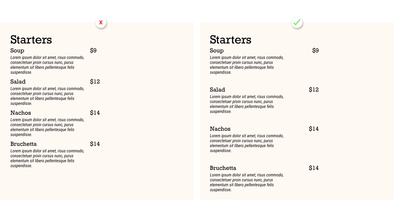
This creates a desire to get as much “above the fold” as possible, which conflicts directly with our new best friend Breathing Room. Sure, it all gets primary real estate in the design, but it’s so crushed in there it’s like me as a 5 year old: ugly, small, and confusing.
If we don’t address the hierarchy problem and answer the question of what is most essential to be communicated, this issue will arise. So address it, give that thing top billing in the design, and trust that it’s better to have secondary characters than to make everybody the superstar.
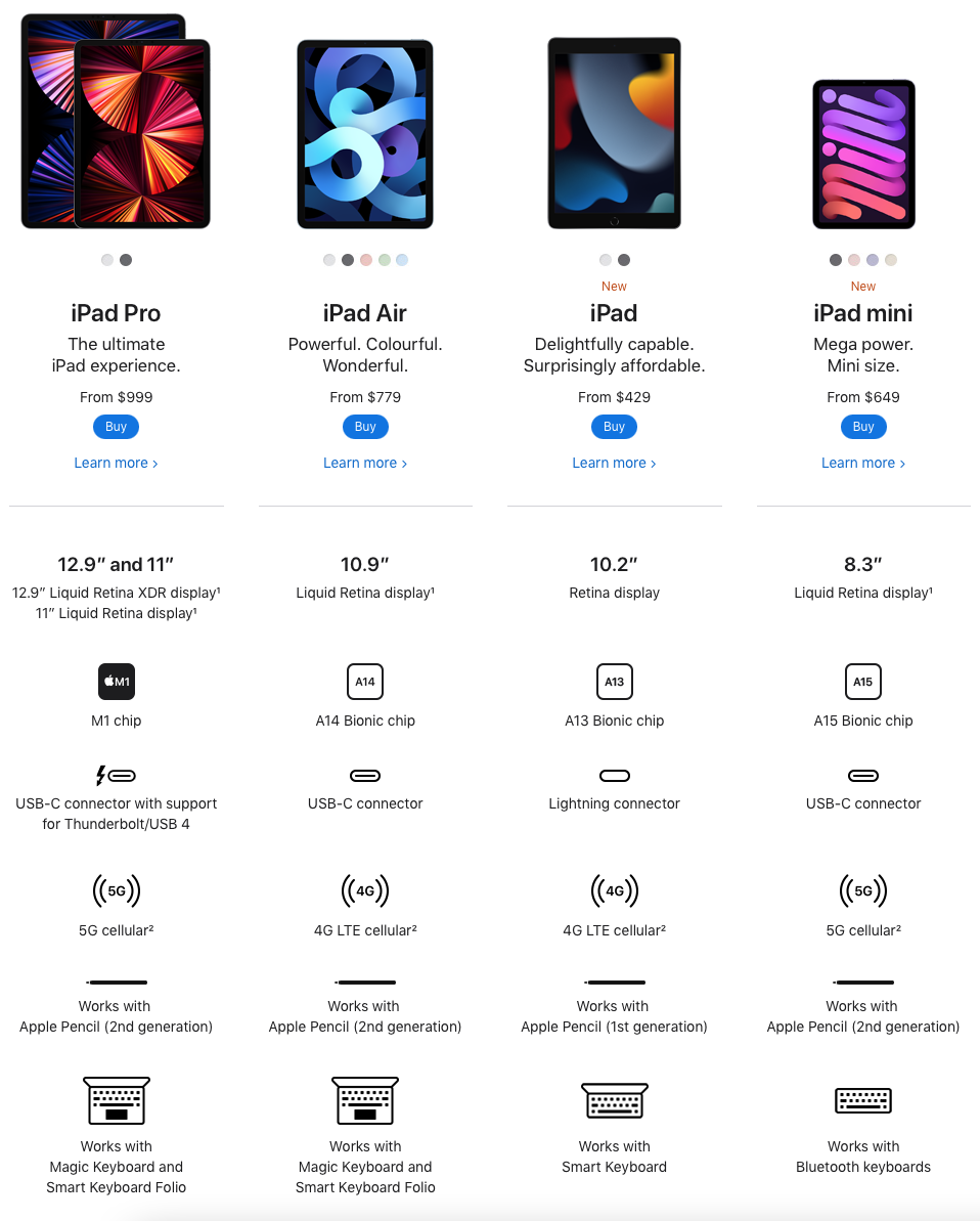
Take a look at everybody’s favourite design example: the Apple website. They show an important distinction about digital design vs. print design, and that’s that people do scroll.
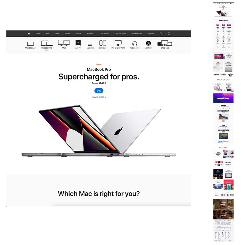
The image here shows that you can offer up all the pertinent information about a product (or line of products) and space it properly. Yes, it makes for a very long page that requires a ton of scrolling. That said, Apple probably spends more money on user research than you or I are likely to see in our lifetimes, so you can feel quite confident that this very long layout has been optimized 1000 times over. The end result? People would rather scroll than have everything crammed into a smaller space.
Create yourself a system
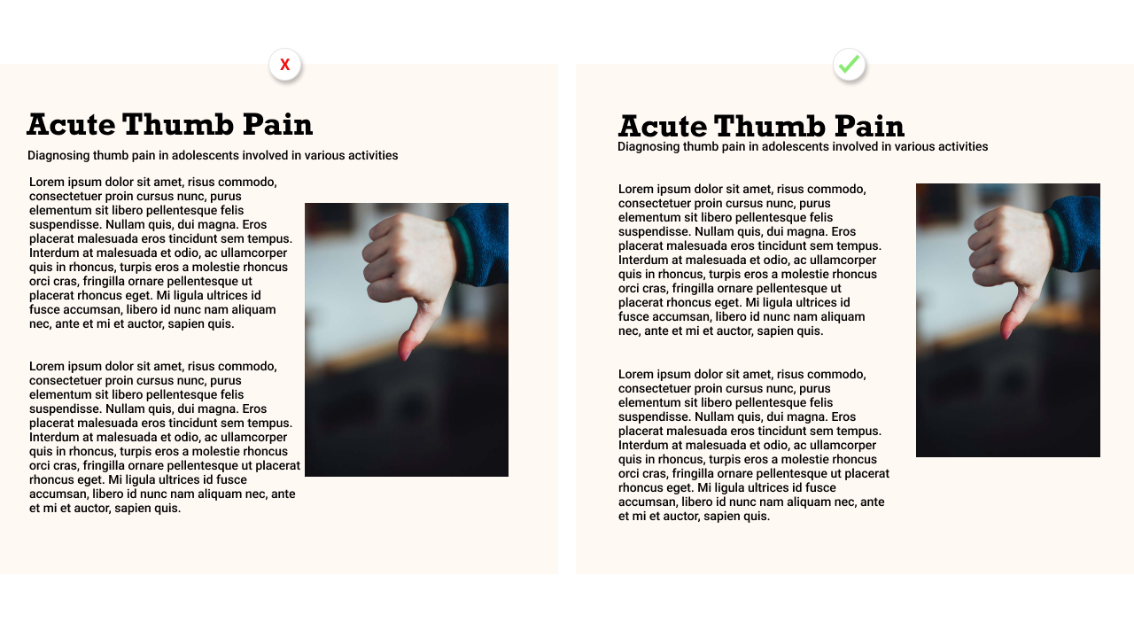
Space is great, but inconsistent space is also one of those things that feels off without being immediately obvious. One way to combat this is to create a guide for yourself. Let’s say your design consists of headlines, paragraphs, and images. Come up with a consistent space that’s going to go between the headlines and the paragraphs, the paragraphs and the images, and the images and their captions.
In design circles, this is referred to as working with a grid. Grids help us keep spacing consistent and aligned, which can make things visually satisfying when properly applied. When applied haphazardly and inconsistency, it can make things stick out like a sore thumb.
Using Colour in Your Design
The next way to communicate is to use colour. Colour can be so fun and we all have our own opinions about what is best. Putting aside our own preferences though, let’s admit some truths: colour theory is a thing, and it’s a communicative tool just like anything else.
Most people look at colour as a pleasing way to add flair, when in reality it can be so much more. It can be added to draw attention to (or away from) something. It can communicate what needs your immediate attention and what is secondary.
Just as we created a spacing plan, we’ll have a colour plan. Maybe you’re designing something for work, and your company already has a set of colours that are commonly used. In that case, stick to those brand colours. Designing something without such constraints? Try a service such as coolors to create yourself a palette. Stick (mostly) to this palette (more on that in a second). For now create a collection of colours that compliment each other well. This is where theory comes into play–not all colours play nicely together–but a system like coolors can help you with that.
What do they mean?
Having trouble deciding? Consider that colours mean different things to different cultures. For example, in the west the following colours are often associated with the following moods:
White: Fresh and Clean (think Apple’s website)
Black: Strong and powerful (think luxury cars)
Silver: Cutting edge and futuristic (ok think Apple’s website again)
Red: Attention-grabbing and emotional (think stop signs)
Blue: Calm, reliable, safe (electronics logos, credit card logos, etc.)
Yellow: Young, happy and free (more seldom used… think… i don’t know… Coldplay?)
Green: Growth, cleanliness (Think every renewable energy logo you’ve ever seen)
They all mean that, every time?
God no. There’s tons of examples of colours breaking out of the mold, so treat these as guidelines. If your business sells solar panels and your logo isn’t green or yellow, you aren’t immediately doomed to failure (in fact, you might even stick out).
We still rely on hierarchy, right?
Well yes, but not necessarily as stringent. You’ve got a small collection of colours to choose from, how to decide what goes where? We can make some obvious choices. Main area can be the primary colour. Maybe we’ll use the secondary and tertiary colour as backgrounds elsewhere.
Remember the sore thumb problem though from above? When we broke convention with our spacing, that thumb stuck out, right? What about when we want something to stick out? We can break convention again, only this time on purpose.
Pay attention to websites that have a button that they really want your to press. Often you’ll find it in a banner or near the top. Maybe it’s a button to buy something or sign up for something. Whatever it is, there’s a good chance it stands out from the rest of the site. In a case such as this, there’s a balancing act that plays out. We want it to match, but not so much that it blends in. Sometimes we don’t just want a button to look nice, we want it to stick out and take a swing at the user.
So only a few colours then
Technically yes. Don’t go nuts with the colours or it’ll look out of control. There is a case for having many subtle variations though. These are variations of your main colours (so don’t just toss a yellow in there to be cheeky), and you can use them to compliment the colours you’ve already gotten.
One good example of this is when we want something subtle on a coloured background. Most default to using a white or a grey. We run into a problem though: the white is way too loud and the grey looks bland. Complimentary colours to the rescue!
By using a lighter shade of the existing colour, it can look like it belongs while also not attracting more attention than we want it to.
Using Text
One of the greatest pro-tips in hierarchy comes from the world of text: When everything is bold, nothing is bold. The Buddha may have said that. I’m not sure. Sounds like him though. We’ve all seen documents where somebody is trying to convey everything, so everything gets bolded and eventually you can barely read over the sound of your own rolling eyes.
Truth is there are many tools to use when we want to direct attention through text. Many rely entirely on bolding and size, and that can create issues.
The problem with size
You’re forgiven for thinking the only thing we need to do here is come up with a scale for our text sizes (which we do, by the way). Giant font size for the most important, and then things decrease from there. We run into an important issue when we do this though: some things look ridiculous at huge sizes, and sometimes the scale works well only in theory and we’re left with important content being too small to read.
The seldom used heroes of typography
We have more at our disposal than size and bolding. We can use the already mentioned methods of space and colour to break up our text. If something requires special attention, maybe whoa back on embiggening and give it some breathing room so it stands alone a little bit. If something requires one or two steps outside the spotlight, perhaps give it a colour with less contrast. What’s beautiful here is that the mind will fill in the gaps for us, and our users will instinctively feel what needs to be seen as a priority instead of getting hit over the head with it.
Make it readable
If there’s a golden rule here, it’s to keep things readable. Thankfully when it comes to design, we’ve got some tricks up our sleeve not known to many.
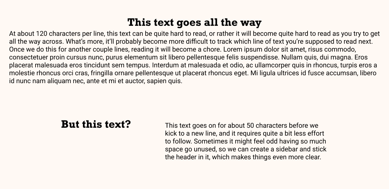
The human eye does not like reading beyond a certain length, so while it instinctively might feel odd to have a bunch of space but not use it, when the goal is clarity, it’s better to keep it short. Typically we don’t want more than about 45-60 characters in a single line (this is why if you’re reading this on a standard computer screen, the text doesn’t flow 100% across the window).
Does it feel too weird to have a lot of space and a short little text box? What if we added a column to keep things interesting? This way instead of a long, narrow section we save some space and get a win by differentiating some sections (I use the space for my pull quotes).
Alignment doesn’t exist for you to screw around for fun. There’s a reason for it! Centred text is awesome for headlines or in short bursts of only 2 or 3 lines. Beyond that though, western cultures are more used to seeing things left aligned. Right aligned? Save that for your spreadsheets, nerds. People love nothing more than that sweet moment when all the decimals line up.
Using Images
A lot of you are using images wrong, but don’t worry this is a safe space of acceptance and love. Seriously though, some of you need to pick it up or I’ll stop loving you.
We keep circling back to this issue of carelessness as being a problem, and few things illustrate this point quite as well as the random use of images. A lot of the time images are used to “punch up” a boring piece of writing, and while that makes sense, have you ever read something boring and thought “sweet image though… maybe I’ll keep reading”. No. Boring writing is boring and you know what? Sometimes there’s no other way. It’s ok. We don’t need to fight it. Adding clutter to a page that needs to exist does not make things better.
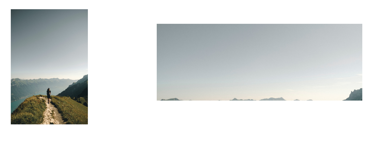
Pay attention to orientation
If you’re not used to using images in things, there’s a curious bit of mental gymnastics that trips some people up. If you’re trying to fill a wide box with a tall image, things are going to get freaky. On the other side of the coin, if you try to fill a tall box with a wide image, stuff is also going to go wrong. What typically happens when the area is differently shaped from your chosen photo, something has to give and the image is cropped aggressively. All of a sudden the image of the hikers on a beautiful mountain vista becomes somebody’s butt and maybe some backpack straps. Pay attention to the area you’re trying to fill, and work from there.
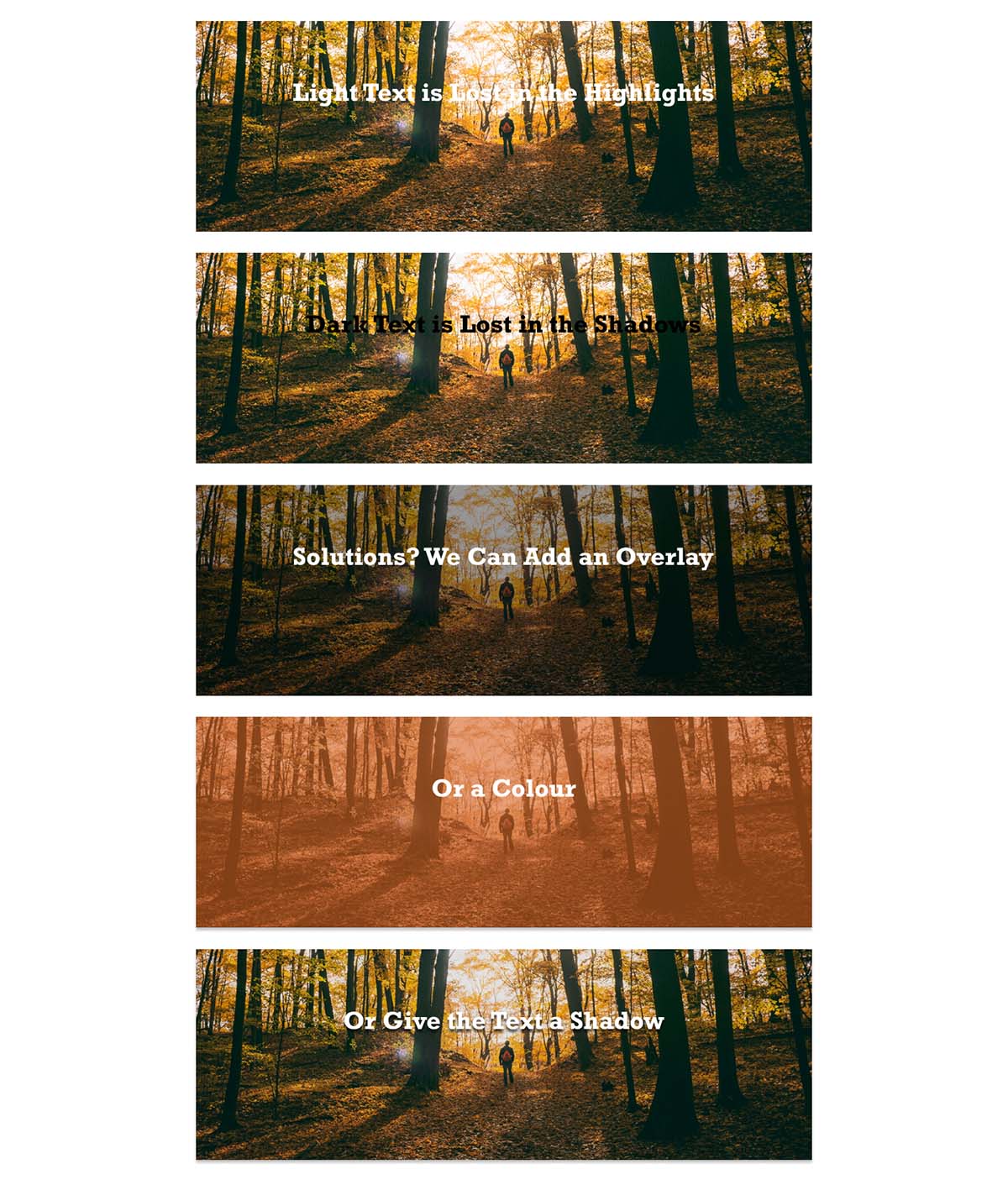
Think about your text
When it comes to adding text on top of a photo, most will treat it as an afterthought. What ends up happening can be any combination of the following:
- The image has intense highlights, rendering any light text on it unreadable
- There’s dark shadow in the image, rendering any dark text on it unreadable
- The image contains both highlights and shadow, meaning there’s no real way to put any text on it
- Where you need the text to go, there’s a face or other focal point of the photo (like a face)
Don’t worry, we have solutions. We can add an overlay to the image, making it lighter or darker, which allows our text to stand out against it. We can also add a colour to the image if that works with our design. Finally, we can add an effect to the text itself such as a shadow to make it pop off the background a bit.
Get Creative
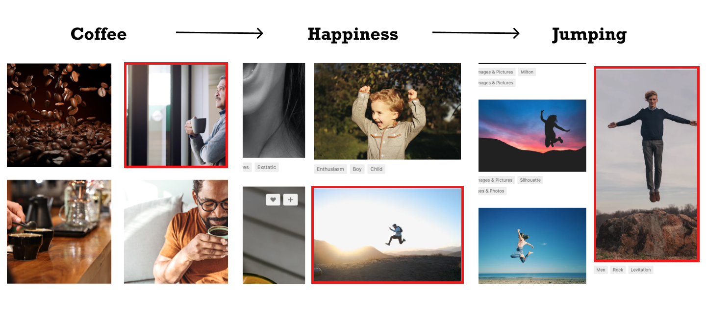
It doesn’t need to be so on the nose all the time. Feel free to have a little fun with it and use some symbolism. One of my favourite tricks (which I only share with you as a reward for making it this far) is to search for a specific term on a stock photo website such as unsplash. I’ll cycle through the photos but get a little lower until I find one that’s a bit off. It’s about the thing, but not 100%.
Let’s use coffee as an example. You want a photo for something you’re designing that involves coffee. Toss “coffee” into the search and you get tons of the usual suspects. Beans. Artsy foam on lattes. Steaming cups. Endless hipsters. Ah ha! A happy person looking out a window.
Let’s do a different search and grab that element, so this time we try “happy person”. Now we get different things. Smiley people, calm people, excited people, people jumping. Coffee amps you up and gives you energy, so let’s lean into these jumping people. New search, this time for “jumping”. Bullseye. A bunch of images of people doing a thing that isn’t coffee by any stretch, but they’re conveying the energy that is coffee. We land on a man doing a cheeky fun jump that looks like he’s levitating, which is probably how a lot of people feel after a cup. We’ve arrived.
Now go ahead and make it more designy
You’ve now got some ideas on how to identify what is most important, where to position it, how to make it stand out, and how to make it clear. Hopefully you can put a few of these together and impress some people. Don’t do it too well though, or you’ll totally become the “office designer” in addition to whatever it is you already do.
A professional designer is always going to save you loads in the end. The world is a cruel and indifferent place though and such options don’t always exist. So when it falls to you, I hope you can find something in here to help you make that thing.