Intro
Accessibility has finally found its way into the conversation and is rightfully being taken with the degree of care it deserves. In short, website accessibility is an umbrella term to describe the act of making a website useable by all people regardless of ability.
It’s very common to fall into a trap of building a website for ourselves. We treat ourselves as the primary customer or user, and this presents obvious problems. Usually this red flag is presented as a business issue that’ll keep you from selling your wares, but on a moral level it presents a deeper problem. You could be unknowingly restricting content from people with extremely common physical and mental challenges.
The good news is the barriers to entry for people can be removed with a little forethought, and you might accidentally make your website better for everybody in the long run.
What types of accessibility challenges?
Many times issues of accessibility are overlooked because it simply doesn’t appear as though there’s many people who would benefit. If we pay closer attention to the challenges that people must work through however, we quickly notice that they impact a sizeable portion of the population.
Visual
Being a visual medium, this one is most often cited when we discuss accessibility issues. While there are tools to help the visually impaired navigate websites, work needs to be done on the part of the company or web person to ensure the website plays nice with those tools.
The issue doesn’t stop at blindness though, as we must also be mindful of people who suffer from lower acuity, colour blindness, and issues with low contrast.
Auditory
Starting a few years ago, companies that push video made the miraculous discovery that video works better than text. This shift has made video more ubiquitous across the web, and as a result offered up a new challenge for hearing-impaired users.
Neurological
Issues of accessibility don’t just centre around the function of our eyes and ears to take in information, but also the processes that translate that information into meaningful experience. With neurological issues, the sense may function typically, but the interpretation becomes a struggle.
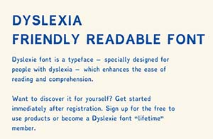
Dyslexia would be one example, whereby the user can see and read just fine, but the appearance of the characters becomes problematic. Other issues might include inability to focus or parse complex amounts of information, or a need to restructure content in a more meaningful way.
Physical
Imagine trying to operate a mouse with a prominent tremor in your hand, or without the use of your hand at all. For people in this category, they might have to use a special mouse or even a tool that fits on a different part of their body such as their mouth.
The good reasons to take accessibility seriously
It’s decent
The most basic argument for accessibility is that it’s simply a decent thing to do. Nobody should have to experience restrictions on the web based on a unique characteristic of their biology or an accident. We would be bothered if we found out important-to-access buildings didn’t have wheelchair ramps, but we don’t often extend that same concern for the people who struggle beyond our line of sight.
There’s more than you realize
People with disabilities are commonly overlooked unless you work directly in that space. This goes doubly for people who have challenges that aren’t immediately obvious to us such as colour blindness or dyslexia. This means there are large swaths of the population that need our help that we haven’t recognized. For example, if we consider colour blindness alone, that’s something that impacts 8% of males and 0.5% of females. T not account for it would be a massive error.
It’s good UX
Accessibility and user experience are close cousins. User experience is another umbrella term that we’ll unfairly boil down to the act of determining the best way to do a thing. We can employ user experience to figure out the best way to sell bananas, use a voting booth, or merge into traffic. For our interest in accessibility, it can (and is) used to determine the best way to serve content to a person who experiences the world differently than others. One reason this is important is often there’s overlap–what improves the experience for one can also improve the experience for the many. Is it important to find a sweet spot of contrast for text so it stands out for a person suffering from low visual acuity? Absolutely. Does it also benefit somebody with 20/20 vision? Of course!
The colder reasons to take accessibility seriously (that are still important)
It’s good business
Let’s not forget everybody’s favourite silver bullet of marketing: Google. You may recall when we explored how google decides which content rises to the top and which falls to the bottom of the stack, we found that Google’s north star is whether the content is helpful for people or not. By that metric, it rewards content that is well-crafted, clear, engaging, and–you guessed it–accessible to all.
Take images for example. Members of the visually disabled community may use a screen reader to get through a webpage. It scans all the content and speaks them aloud. If you employ images, this can be very frustrating for somebody using a tool that can’t explain them. This is why we have alt text coded on images when we put them into a website. A screen reader will read aloud this text to give the user context about the image they aren’t seeing. If you don’t have alt text on your images, blind people aren’t the only ones that will want you dead… Google will be furious. If there’s a golden rule, it’s don’t make Google furious.
It helps get content across different devices
The days of needing your content to show nicely on a standard computer monitor and maybe a laptop have been gone for quite some time. The rise of the smart phone gave way to a massive uptake in responsive design, which meant content became more fluid to fit any screen size. This became paramount as we started using different screens. Today we use everything from TVs to wristwatches to view content, so this fluid content is very important.
As we develop tools to get around various physical and mental barriers for people, this fluidity is crucial, so it’s best we keep it always in mind. If the goal is to reach as many people as possible, it’s wise to ensure we have as few things getting in the way as possible.
In certain circumstances, you have to
For many large businesses (for example ones that are either directly involved or tangentially involved with the government), matters of accessibility are not an option. Business doesn’t happen if you don’t follow the rules. There are many vendors that make their purchase selections with accessibility in mind. They aren’t even allowed to purchase goods or services from businesses that don’t meet accessibility standards. So if all of the above hasn’t convinced you of the importance of accessibility, perhaps the mighty stick of business can persuade you otherwise.
OK I’m convinced. When do we start?
Ideally, the accessibility work is done from the very beginning. It’s much harder to implement these changes into a system that’s already up and running. That said, should you find yourself in such a situation, it’s still obviously worth it.
It works best when there’s buy-in from every level. Web projects can have many players involved. If you’re just starting out, make this a part of your vetting process when you’re looking to hire somebody. Don’t just ask if they take accessibility seriously, as if the entire team takes it seriously.
It will require some degree of ego management. A designer may have built something that speaks to them artistically, but at the end of the day if it excludes a portion of the population, they’ll have to make sacrifices. A developer may have created something very cool, but if it can’t be operated by all users, they’ll have to find another way. A manager (or you) may have a time crunch, but at the end of the day they’ll need to see there’s no point to shipping a product that is unusable for many.
Let’s fix some problems
We’ve already gone over some specific populations that are likely to benefit from accessibility improvements. Let’s ask some questions about our websites so we can best serve them.
Visually impaired
- Does the site layout break if somebody were to use a screen magnifier?
- Was the colour scheme created with colour-blindness in mind?
- If the website uses subtle variations of shade to communicate visual hierarchy, is there anything critical that would be missed by somebody in this category?
Hearing impaired
- If you have videos, have you also added captions? Are they synced properly with the audio and presented in the language your users will be most likely using?
- Do the captions suck? Did you use a tool to generate them without sweeping for errors (which are very common)?
- Do you have volume controls that are obvious to the user who might need things at a different level?
- Can you provide a transcript so if somebody doesn’t want to use the video, they don’t have to?
- Is it possible to have a sign language component for live situations where it’s unfeasible to have accurate captions or transcripts available?
Neurological impairments
- Is your text styling locked down to the point that dyslexics can’t change it to use fonts that help them read the content?
- Can you offer more styling options, so users can adjust things beyond the text such as colours and backgrounds?
- Is your navigation clear and concise so as to not confuse somebody who might have a hard time processing too much information at once?
Physical
- Do you force your users to complete any tasks that require unnecessarily high precision such as a popup with a small close button?
- Have you employed any “scroll-jacking” where the content is presented in an unfamiliar way, such as requiring the user to scroll sideways or perform some manner of motor-gymnastics? These ploys can seem cute and flashy, but it’s usually a case of some designer or developer waving their tail in your face and bragging about how clever they are. Don’t let them (or make them) do that.
Conclusion
This post barely scratches the surface of what we can do with accessibility, but it is a logical starting point to identify the problem and reasons for solving it. The web was promised as a way to free us all and put us all on a more even playing-field. While that certainly hasn’t proven to be the case across the board, we owe it to our fellow citizens to try.


